More inkscape bits learned doing posters
Context: 240423-1912 Better Posters notes
Grids
- Two — once in document properties, and there seems to be a tool for this as well.
- units are important — doing math in mm and then creating a grid in px/pc/pt/… may create not-obvious errors
- Snapping to an invisible grid still works — neat for a sub-grid that would create too much garbage but is needed (e.g. margins in a column)
Selecting
- You can select items by color/stroke/type/… in Edit -> Select…
- E.g. select all texts, all blue rectangles etc.
Resizing boxes
You can disable scaling the stroke size together with the box in the upper-right toolbar! (The same one where locking aspect ratios is)
Text
- You can draw a rectangle and then add text to it — use the text tool to draw this rectangle.
- Text -> Flow into frames can do what it says on the label:

- If it looks weird or different from other text but font and size and the rest match, the text likely has a stroke.
Tracking invisible items
For things into which text “flows” etc. — if you have a white background making them white works for keeping them selectable when needed. (And removing the background makes them visible).
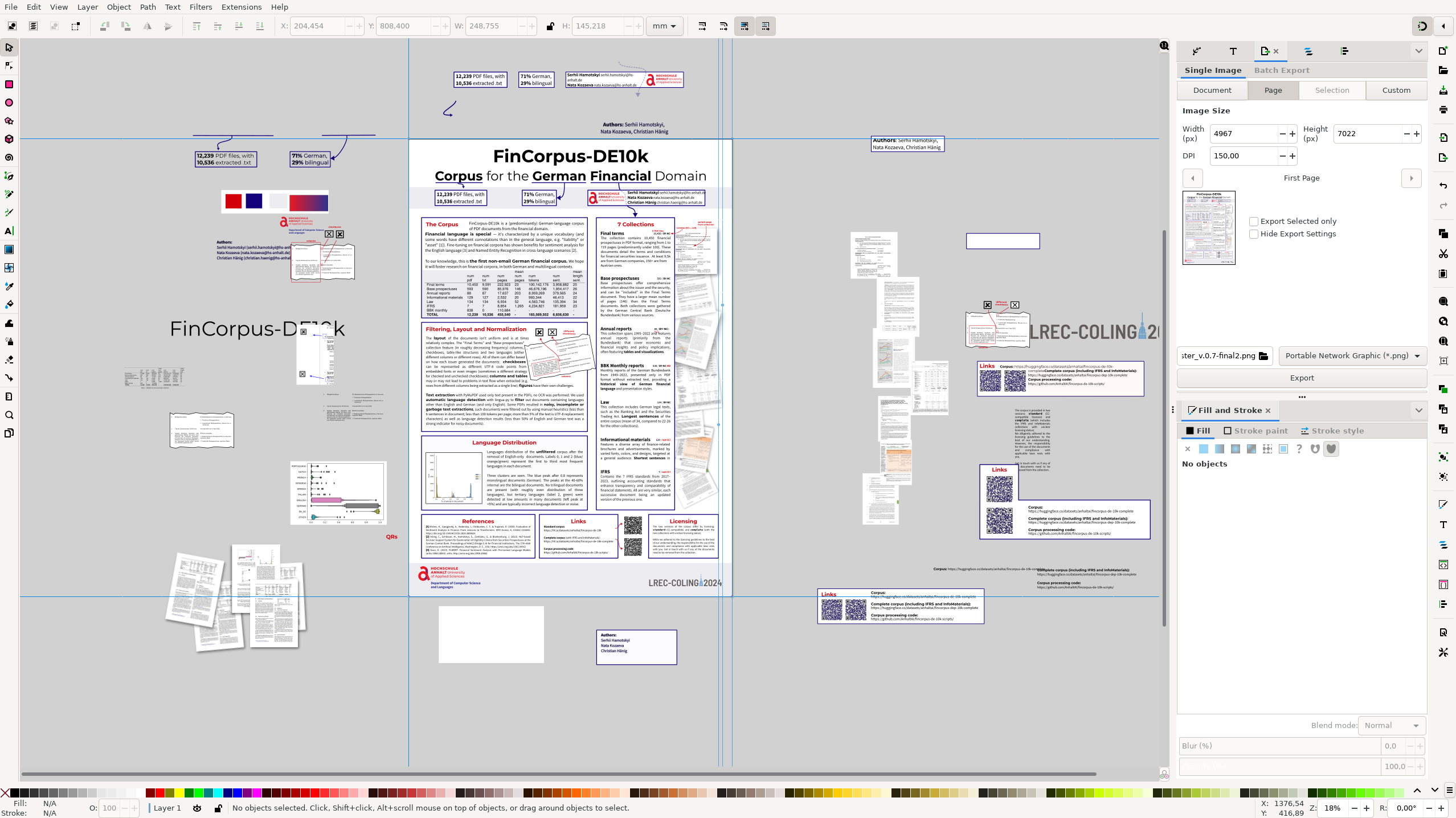
Smile for the screenshot
Damn I love doing random vector stuff.

Nel mezzo del deserto posso dire tutto quello che voglio.
comments powered by Disqus