More quarto reveal presentation notes for lecture slides
References
- Refs:
- Previously:
- 240424-1923 Presentations with Quarto and Reveal.js has my list of tricks
- Code
Misc
Better preview at a specific port, handy for restarting after editing CSS. Similar to quarto project frontmatter preview: port: 4444 browser: false.
quarto preview slides.qmd --port 4444 --no-browser
Supported by default
In frontmatter:
logois in bottom-right+footer-logo-link
footerfor all slides- overwrite with div of class
footer
- overwrite with div of class
- Likely relevant for me: Numbering reveajs options for dynamic bits,
shift-heading-level-by,number-offset,number-section,number-depth— will touch if I need this.
Headers
- Extension: shafayetShafee/reveal-header: A Quarto filter extension that helps to add header text and header logo in all pages of RevealJs slide2
- Has absolutely awesome documentation!
In front matter:
header: one header text for all presentationtitle-as-header,subtitle-as-header: iftrue, place the presentation frontmatter’stitle/subtitleas header if one not provided (overwriting theheadervalue)- use-case: I same repeating text everywhere w/o specifying it every time.
hide-from-titleSlide:all/text/logoto hide it from title slidesc-sb-title: iftrue, h1/h2 slide titles will appear in the slide header automatically whenslide-levelis 2 or 3
Divs with classes:
-
.header: slide-specific header -
Excellent example from its docu of dynamic per-(sub-)section headers:
Left/right/center blocks of text in header
- If one uses section/subsection titles, they go in the left third and right third of the header, with the normal header text in the middle. This is neat to have in general, w/o the section/subsection titles.
- sc-title, on the left, is section title
- sb-title, on the right, is subsection title
- How do I add arbitrary text there? And what would be a good interface for it?
The right way — extension code
- I could look at the extension, maybe fork it, and find a way to put text in these divs
- Relevant code:
- This JS populates them in each slide: reveal-header/_extensions/reveal-header/resources/js/sc_sb_title.js at main · shafayetShafee/reveal-header
- add_header js: reveal-header/_extensions/reveal-header/resources/js/add_header.js at main · shafayetShafee/reveal-header
- Main lua: reveal-header/_extensions/reveal-header/reveal-header.lua at main · shafayetShafee/reveal-header
Ugly CSS hack
- (Learn sass in Y Minutes)
- CSS for the header bits: reveal-header/_extensions/reveal-header/resources/css/add_header.css at main · shafayetShafee/reveal-header
Since .s[c|b]-title is present always, text added that way will be present on the title slide regardless of settings. … and — adding text to a presentation through CSS is, well, ..
.reveal-header .sc-title {
  background-color: red;

	&::before {
		content: 'sc-title header content';
  }

}
Slightly better ugly hack: main header text split in three, with two aligned l/r correspondingly.
.header-right {
  // text-align: left;
  float: right;
  background-color: pink;
  display: inline-block;
}

.header-left {
  // text-align: left;
  float: left;
  background-color: yellow;
  display: inline-block;
}
::: header
[left]{.header-left} and not left [and right]{.header-right}
:::
Result:

Extended ugly SCSS hack
Improved the above to support both footer and headers I have a hammer and everything is a nail SCSS can do mixins let’s use them
// L/R margins of the footer — if logo is wider than this, it may overlap right footer text.
// By default, logo max-height is 2.2em, width auto based on this.
$footer-margin: 5em;

// left or right column bits
%hfcol {
  display: inline-block;
}


/* L/R columns in header */
.reveal .reveal-header .rightcol {
  @extend %hfcol;
  float: right;
}

.reveal .reveal-header .leftcol {
  @extend %hfcol;
  float: left;
}

/* L/R columns in footer */
.reveal .footer .leftcol {
  @extend %hfcol;
  float: left;
  margin-left: $footer-margin;
}

.reveal .footer .rightcol {
  @extend %hfcol;
  float: right;
  margin-right: $footer-margin;
}
Usage:
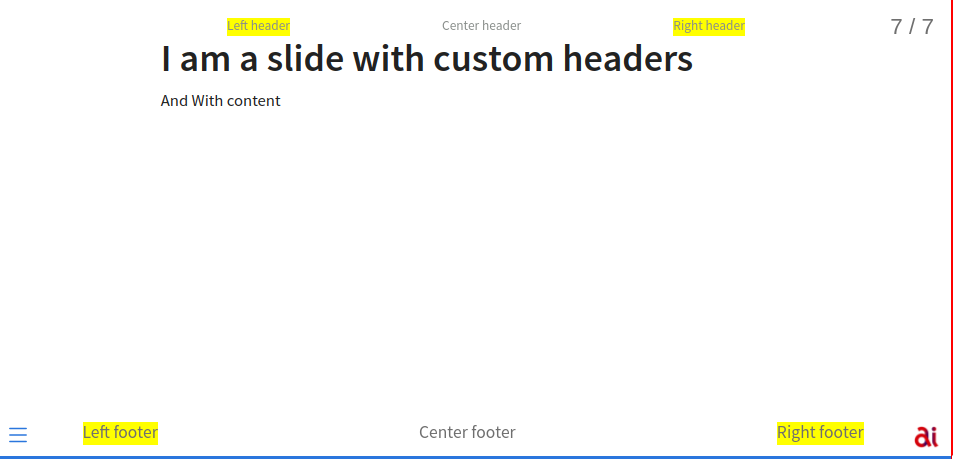
## I am a slide  with custom headers

And With content

::: footer
[Left footer]{.leftcol} Center footer [Right footer]{.rightcol}
:::

::: header
[Left header]{.leftcol} Center header [Right header]{.rightcol}
:::
Frontmatter usage works only for footer, likely header doesn’t support markup.
footer: "Center footer [right]{.rightcol} [left]{.leftcol}" # CHANGEME
Result:

PROBLEMS:
- asymmetrical if only one of the two is present. Likely fixable, but I don’t want to force any center div.
Footers through qmd cols
This works almost perfectly, including missing values:
::: footer

::: {.columns}
:::: {.column width="20%"}
left
::::
:::: {.column width="50%"}
Center footer
::::
:::: {.column width="20%"}
right
::::
:::

:::
It even works inside frontmatter as multiline string (not that it’s a good idea):
    footer: |
      ::: {.columns}
      :::: {.column width="20%"}
      left
      ::::
      :::: {.column width="50%"}
      FB5 – Informatik und Sprachen: Deep Learning (MDS)
      ::::
      :::: {.column width="20%"}

      ::::
      :::
This removes the margin placing it exactly in the same place as a normal footer:
.reveal .footer p {
  margin: 0 !important;
}
(but headers don’t work)
What is a good interface?
A filter that parses frontmatter and puts things in the correct places.
