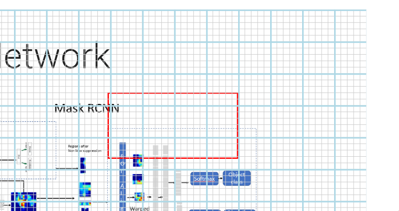
Quarto CSS grid to better position absolute elements
Very proud of this idea, haha :)
For absolute positioned elements one needs to “guess” the correct sizes etc., may not be trivial. Using a pixel ruler won’t help because the .absolute coords don’t map to the screen ones.
Solution:
.grid {
  // https://stackoverflow.com/questions/4191260/drawing-a-grid-using-css
  background-image:
    repeating-linear-gradient(lightblue 0 2px, transparent 2px 100%),
    repeating-linear-gradient(90deg, lightblue 0 2px, transparent 2px 100%);
  background-size: 50px 50px;
  //border: 2px solid red;
}

.smallgrid {
  background-image:
    repeating-linear-gradient(#ccc 0 1px, transparent 1px 100%),
    repeating-linear-gradient(90deg, #ccc 0 1px, transparent 1px 100%);
  background-size: 10px 10px;
  width: 100%;
  height: 100%;
}
::::: {.absolute left=0 right=0 top=0 bottom=0 .grid}
::: {.smallgrid}
:::
:::::

It’s not exactly aligned but close enough to judge the widths and heights involved!
Rectangle in the pic is:
:::: {.redrect .absolute right=200 top=130 width=200 height=100}
::::
(And the small grid can be omitted if not needed by removing the div in the middle. )
For bonus points, can be saved as a file and included if needed:
{\{< include ../_shared/smallgrid.qmd >}\}
ALSO:
// show the border of the slide
.reveal .slides {
  border: 1px dashed red;
}
Nel mezzo del deserto posso dire tutto quello che voglio.
comments powered by Disqus