More label studio annotation templates notes
Resources
- Label Studio Enterprise — Data Labeling & Annotation Tool Interactive Demo
- I always look for it, it shows things like scrollable fields, columns, the building blocks basically. Especially the advanced config templates.
Template bits
Adding sample data to template
(Shown somewhere in examples d but I always have to look for it)
<Header value="xxx" />

<!-- {
"data": {
  "index": 4,
  }
} -->
Since spaces don’t matter, this is even better for copypasting new versions:
<Header value="xxx" />

<!-- { "data":

{
  "index": 4,
}

} -->
toName
Applying stuff to multiple names: comma-separate them 1
EDIT: this doesn’t result in an error but quietly drops annotations and makes them not-editable, TODO bug report!
<Header value="Which text is better?" size="6" />
<Choices ... toName="name_a,name_b">
Choices
-
Choices by radio button instead of checkmarks for single choice: `
- TL;DR always use this, I hate that the checkmark design language is going away
-
Inline choices:
layout="inline" -
Value is shown in the screen, alias can override that in json output:
<Choice alias="1" value="Completely mismatched tone/content"/>will be1in json `
Formatting
Formatting text with info — couldn’t find anything better than this abomination:
<View style="display: flex;">
	<Header value="How well is this advertisement tailored for group '" size="6" />
	<Header value="$target_group" size="6" />
	<Header value="'?" size="6" />
</View>
Or:
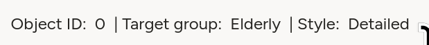
  <View style="display: flex;">
    <Text name="l_obj_id" value="Object ID:" /> <Text name="t_object_id" value="$object_id"/>
    <Text name="l_target_group" value="| Target group:" />  <Text name="t_target_group" value="$target_group"/>
	<Text name="l_style" value="| Style:" /> <Text name="sty" value="$text_style"/>
  </View>
Style/layout
Styling tables
The <Table> tag generates a table with headers based on dict with key/value pairs.
This compresses it:
  <Style>
    .ant-table-cell {
    	padding: 0;
    	font-size: 0.75rem;
    	line-height: 1; /* Removes vertical space added by line height */
        }
	.ant-table-tbody td {
    	padding: 10px !important;
    }

	/* And this sets the column widths */
    .ant-table-thead th:first-child,
    .ant-table-tbody tr td:first-child {
    	width: 40%;
    }
    .ant-table-thead th:last-child,
    .ant-table-tbody tr td:last-child {
		width: 60%;
    }
  </Style>
Generating tables as HTML
The native tag has very few options for config, in most cases rolling our own is a good idea.
This quick undocumented ugly function generates a label-studio-like table structure (except it’s missing missing <thead> that I don’t need) from a key/value dictionary.
def poi_to_html_table(poi: dict[str, str]) -> str:
    DIVS_OPEN = '<div class="ant-table ant-table-bordered"><div class="ant-table-container"> <div class="ant-table-content">'
    TABLE_OPEN = '<table style="table-layout: auto;">'
    TBODY_OPEN = '<tbody class="ant-table-tbody">'
    TR_OPEN = '<tr class="ant-table-row">'
    TD_OPEN = '<td class="ant-table-cell">'

    TABLE_DIVS_CLOSE = "</tbody></table></div></div></div>"

    res = f"{DIVS_OPEN}{TABLE_OPEN}{TBODY_OPEN}"
    for k, v in poi.items():
        res += f"{TR_OPEN}{TD_OPEN}{k}</td>{TD_OPEN}{v}</td></tr>"
    res += TABLE_DIVS_CLOSE
    return res
TO STYLE THEM, SEE BELOW
Styling HTML by including it inline
<HyperText name="poi_table" value="$poi_html" inline="true" />
If you want to generate HTML and apply styles to it, the HyperText should be inline, otherwise it’ll be an iframe. Above, $poi_html is a table that then gets styled to look like native tables through .ant-table-... classes, but the style lives in the template, not in $poi_html.
Scrollable areas
Very very handy for texts of unknown length, especially inside columns:
<View style="height: 500px; overflow: auto;">
	<Text name="text" value="$text" />
</View>
EDIT: max-height for multiple stacked windows is golden!
Making scrollbars visible
Don’t ask how or why, but this works as of 1.21.0. I don’t know enough tailwind to say why does the approach from this fiddle with !important fails. Or why does the background of the scrollbar gets set always on chrome, but only on hover for firefox.
.scroll {
	scrollbar-color: crimson blue !important; /* scrollbar, background */
	scrollbar-width: auto !important; /* Use OS default instead of thin, only Chrome */
}
Related: scrollbar-color - CSS | MDN, Scrollbar Styling with Tailwind and daisyUI - Scott Spence
Multi-column layouts
<View style="display: grid; grid-template: auto/1fr 1fr; column-gap: 1em">`
(or)
<Style>
	.threecols {display: grid; grid-template: auto/1fr 1fr 1fr;}
	.twocols {display: grid; grid-template: auto/1fr 1fr;}
</Style>
Patterns
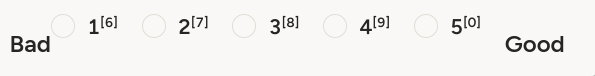
  <Choices name="xxxx"  choice="single-radio" toName="obj_desc_a" layout="inline">
    <View style="display: flex;">
      <Header size="6" value="Bad" />
      <Choice value="1" />
      <Choice value="2" />
      <Choice value="3" />
      <Choice value="4" />
      <Choice value="5" />
      <Header size="6" value="Good" />
     </View>
  </Choices>
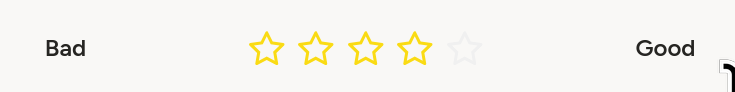 (Preserving l/r width)
  	<View style="display: grid; grid-template: auto/300px 300px 300px; place-items: center;">
      <Header size="6" value="Bad" />
      <Rating name="444"  toName="obj_desc_a" maxRating="5" />
      <Header size="6" value="Good" />
	</View>
You can make the options short and place additional info in hints!
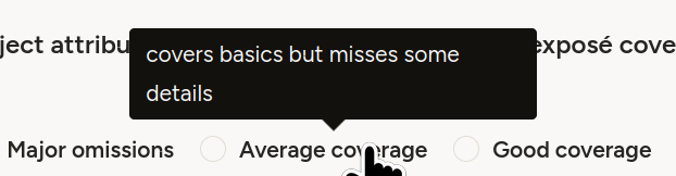
<Choice alias="3" value="Average coverage" hint="covers basics but misses some details"/>
Misc
- Disabling template/layout hotkeys (the ones on the options):
- disable once in annotation settings, works across all projects
- Set explicitly to nothing
- For tab/indent formatting when in the template editor, ctrl-(backspace/delete) helps
CSS etc. links
-
Seen here: Label Studio — Pairwise Tag to Compare Objects ↩︎