Presentations with Quarto and Reveal.js
Basics
-
Oh it has another page with a clean reference! Quarto – Revealjs Options
-
Default presentation size is 1050x700
Presenting
    slide-number: true
    hash-type: number
Hide slide:
## Slide Title {visibility="hidden"}
Slides themselves
Title slide
If you exclude title and author from frontmatter, no title slide will be created and you can create your own
Asides
Asides exist: :::{.aside}
Format
-
Many bits from Quarto – Markdown Basics etc. apply for presentations as well!
-
Comments are HTML comments.
- Other options exist but it’s still the best one. How to comment out some contents in .qmd files? · quarto-dev/quarto-cli · Discussion #3330
-
[this is a div]{.to-which .i-can add="stuff"} -
For slides w/o titles you can still do this
# {background-image="https://upload.wikimedia.org/wikipedia/commons/2/2b/Ouroboros-Abake.svg" background-position="center" background-size="contain" .center}
Centering stuff
- TODO
- Vertical/Horizontal
- Vertically and horizontally centered content in slides (revealjs) · quarto-dev/quarto-cli · Discussion #2951
- css - Vertical Align of images in Quarto Presentations - Stack Overflow
Complex layouts are possible with layouts:
::: {layout="1],[-1,1,1,1,-1"}
{.nostretch width="500px" fig-align="center"}
{.nostretch width="200px"}
{.nostretch width="200px"}
{.nostretch width="200px"}
:::

Classes
## {.classname}

::: {.classname}
div with class=classname
:::

::: {}
div with no class — we still need the {} for it to be a div
:::

::: {.one-div}
:::: {.inside-another}
But the number of : doesn't matter as long as it's >3 — they aren't even matching by count, it's just divs inside divs inside divs, the number of : is just for readability
::::
:::
Plugins
Attribution
quarto-ext/attribution: Display attribution text sideways along the right edge of Revealjs slides.
format:
revealjs: ...
revealjs-plugins:
- attribution
---
## attribution
{.nostretch width="600px" fig-align="center"}
::: {.attribution}
Photo courtesy of [@ingtotheforest](https://unsplash.com/@ingtotheforest)
:::
Roughnotation
R to run.
Sample presentation: RoughNotation; its source: quarto-roughnotation/example.qmd at main · EmilHvitfeldt/quarto-roughnotation
---
title: Simple roughnotation setup
filters:
   - roughnotation
---
- [type]{.rn rn-type=circle}
- [animate]{.rn rn-animate=false}
- [animationDuration]{.rn rn-animationDuration=20000}
- [color]{.rn rn-color=blue}
- [strokeWidth]{.rn rn-strokeWidth=3}
- [multiline multiline multiline multiline multiline multiline multiline multiline multiline multiline]{.rn rn-multiline=true}
- [iterations]{.rn rn-iterations=1}
- [rtl]{.rn rn-rtl=false}

also

{.rn rn-type=underline}
Key bits:
And this will be [circled]{.rn rn-type=circle rn-color=orange}
and [underlined]{.rn rn-type=underline rn-color=orange rn-animate=false}
and [boxed]{.rn rn-type=box rn-color=blue rn-animate=false}
and [crossed]{.rn rn-type=crossed-off rn-color=blue rn-animate=false}
and [crossed again]{.rn rn-type=strike-through rn-color=blue rn-animate=false}

rn-index=2 for order so that the animations happpen one after the other
Works for entire divs as well: RoughNotation
Problems with RN
It highlights the wrong places for me if the presentation is too narrow, both on mobile and desktop browsers; zooming out helps but too much breaks it again. EDIT: a known issue mentioned in the last slide of the sample presentation, they also suggest zooming.
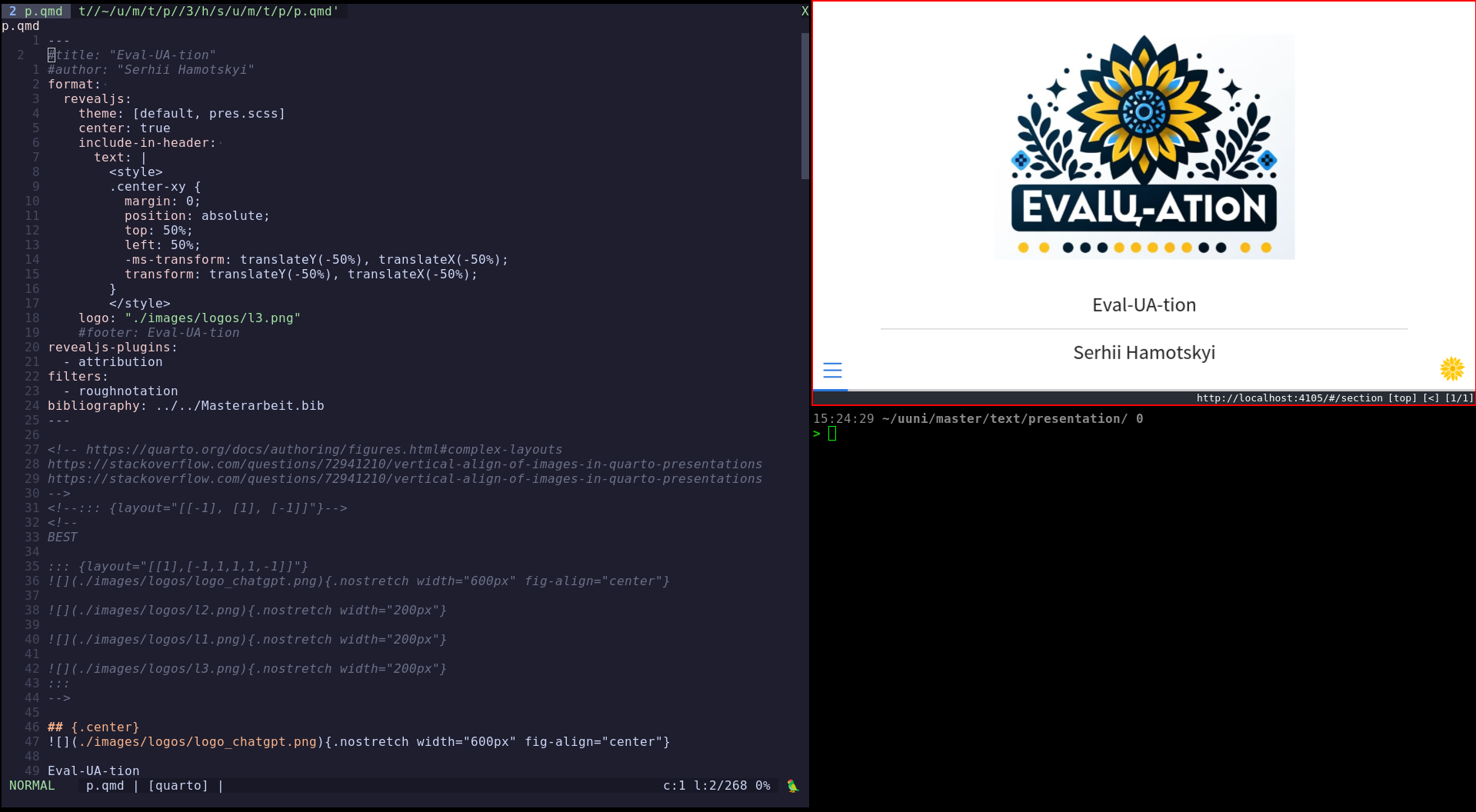
EDIT: No one said I have to use half a screen for previewing, this is a nice layout that solves multiple problems:

Themes
Default theme: quarto-cli/src/resources/formats/revealjs/quarto.scss at main · quarto-dev/quarto-cli
Centering everything
/*-- scss:defaults --*/
$presentation-slide-text-align: center !default;
format:
  revealjs:
    theme: [default, my_scss_file.scss]
BUT for some things it’s ugly, like lists. Then:
.notcenter {
  text-align: left;
}
## UA-CBT
### Outline
::: {.notcenter}
- English example
	- Morphology
	- Agreement
:::
Smaller
{.smaller} works on full slides only, this works for divs too:
.newsmaller {
	font-size: calc(#{$presentation-font-size-root} * #{$presentation-font-smaller});
}
Increasing slide number size
.reveal .slide-number {
	font-size: 30px !important;
}
Cool links from elsewhere
Both linked by the excellent and thorough Beautiful Reports and Presentations with Quarto
References / citations
Quarto – Citations & Footnotes
.biblatex file exported from Zotero and optonally a CSL style (citation-style-language/styles: Official repository for Citation Style Language (CSL) citation styles.)
bibliography: ../../Masterarbeit.bib
csl: ./diabetologia.csl
---

# etc. In diabetologia this gives the usual [1] thingies.
[@key]
[see @key]
Then autocomplete in vim-quarto (!)
Dynamism and animations
Incremental lists are {.incremental},
or the entire presentation can be
  revealjs:
    incremental: true
with {.nonincremental} parts.
Otherwise Fragments1 exist with more control.
r-stack allows to make images overlapping: Quarto – Advanced Reveal
Simple template for slides with everything
## Title {.smaller}
::: {.notcenter}
Descr.

:::: {.incremental}
- some
- list
::::
:::

<!-- footnotes here if needed
[^leaderboard]: <https://huggingface.co/spaces/HuggingFaceH4/open_llm_leaderboard>
-->

::: {.notes}
sp. notes.
:::

::: footer
Chapter - Section
:::
Bits
CSS inside slides
The excellent page of quarto presentation tricks Meghan Hall has this:
Text with [red words]{style="color:#cc0000"}.
No special CSS classes needed!