Seaborn how-to guide
Intro
I like seaborn but kept googling the same things and could never get any internal ‘consistency’ in it, which led to a lot of small unsystematic posts1 but I felt I was going in circles. This post is an attempt to actually read the documentation and understand the underlying logic of it all.
I’ll be using the context of my “Informationsvisualisierung und Visual Analytics 2023” HSA course’s “Aufgabe 6: Visuelle Exploration multivariater Daten”, and the dataset given for that task: UCI Machine Learning Repository: Student Performance Data Set:
This data approach student achievement in secondary education of two Portuguese schools. The data attributes include student grades, demographic, social and school related features) and it was collected by using school reports and questionnaires
Goal:
- Mental picture of the different important architectural parts (figure/axis-level functions)
- Clarity about where are matplotlib things exposed
- Central place for the things I need every time I do seaborn stuff, that are currently distributed in many small posts
I’m not touching the seaborn.objects interface as the only place I’ve seen it mentioned is the official docu and I’m not sure it’s worth digging into for now.
Basics
An introduction to seaborn — seaborn 0.12.2 documentation
Themes and setting the (default) theme
# sets default theme that looks nice
# and used in all pics of the tutorial
sns.set_theme()
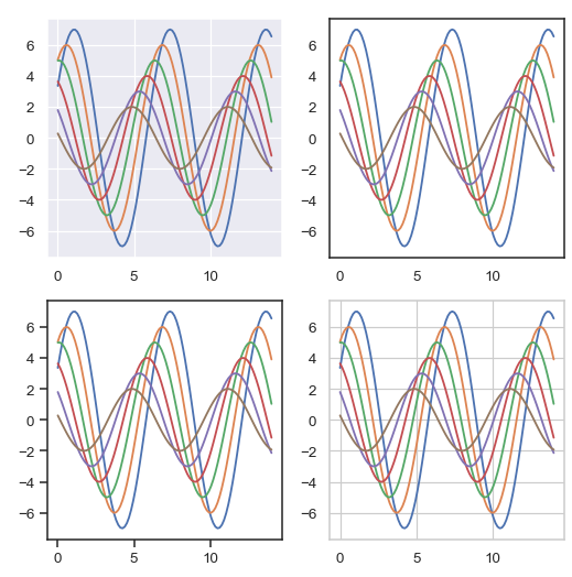
- Themes: darkgrid (default), whitegrid, dark, white, and ticks.
- Refs:
- Tutorial / list of themes: Controlling figure aesthetics — seaborn 0.12.2 documentation
- seaborn.set_theme — seaborn 0.12.2 documentation
Links
- API reference — seaborn 0.12.2 documentation
- is very logically built and is the best list of ‘what exists’
- Intro / tutorials:
Figure-level vs. axes-level functions2
Overview of seaborn plotting functions — seaborn 0.12.2 documentation:
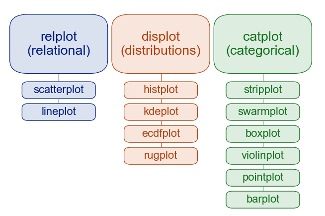
Basics
Functions can be:
- “axes-level”: They plot data onto a single
matplotlib.axes.Axesobject and return it- Contains the legend on the plot
-
The axes-level functions are written to act like drop-in replacements for matplotlib functions. While they add axis labels and legends automatically, they don’t modify anything beyond the axes that they are drawn into. That means they can be composed into arbitrarily-complex matplotlib figures with predictable results.
- “figure-level”: interface through a seaborn object that manages the figure
- (usually a
FacetGrid) - Each module has a single figure-level function that creates/accesses axes-level ones (through the
kind=xxxparameter) - Have the
col=androw=params that automatically create subplots! - They take care of their own legend
-
The figure-level functions wrap their axes-level counterparts and pass the kind-specific keyword arguments (such as the bin size for a histogram) down to the underlying function. That means they are no less flexible, but there is a downside: the kind-specific parameters don’t appear in the function signature or docstring
- (usually a
Special cases:
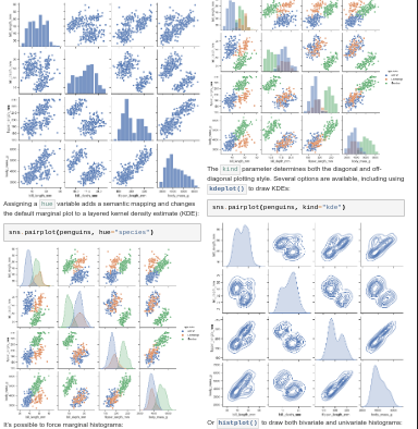
sns.jointplot()3 has one plot with distributions around it and is a JointGridsns.pairplot()4 “visualizes every pairwise combination of variables simultaneously” and is a PairGrid
In the pic above, the figure-level functions are the blocks on top, their axes-level functions - below. (TODO: my version of that pic with the kind=xxx bits added)
Customization
Figure-level
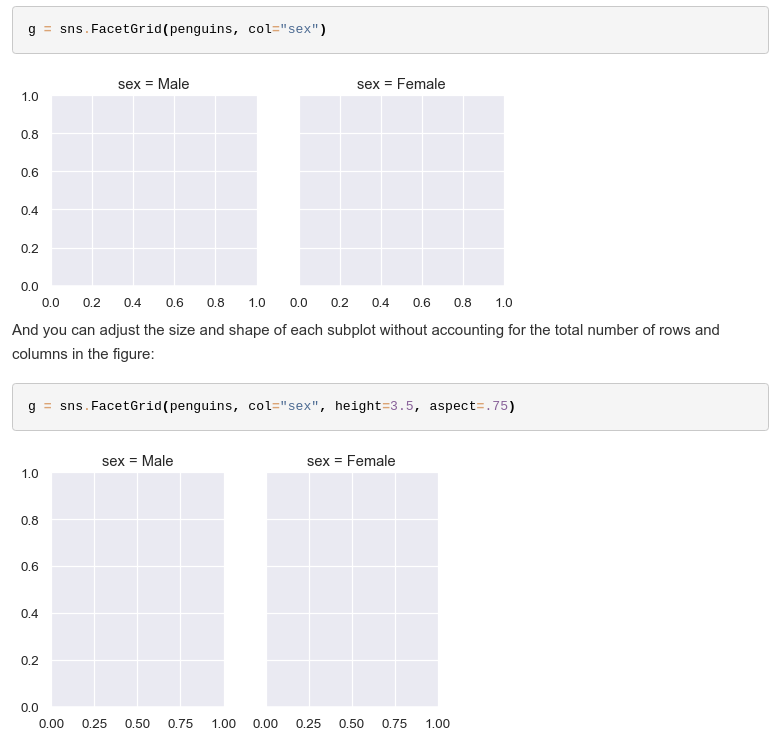
The returned seaborn.FacetGrid can be customized in some ways (all examples here from that documentation link).
FacetGrid customization params
g.map_dataframe(sns.scatterplot, x="total_bill", y="tip")
g.set_axis_labels("Total bill ($)", "Tip ($)")
g.set_titles(col_template="{col_name} patrons", row_template="{row_name}")
g.set(xlim=(0, 60), ylim=(0, 12), xticks=[10, 30, 50], yticks=[2, 6, 10])
g.tight_layout()
g.savefig("facet_plot.png")
Accessing underlying matplotlib objects
It’s possible to access the underlying matplotlib axes:
g = sns.FacetGrid(tips, col="sex", row="time", margin_titles=True, despine=False)
g.map_dataframe(sns.scatterplot, x="total_bill", y="tip")
g.figure.subplots_adjust(wspace=0, hspace=0)
for (row_val, col_val), ax in g.axes_dict.items():
    if row_val == "Lunch" and col_val == "Female":
        ax.set_facecolor(".95")
    else:
        ax.set_facecolor((0, 0, 0, 0))
And generally access matplotlib stuff:
ax: The matplotlib.axes.Axes when no faceting variables are assigned.axes: An array of the matplotlib.axes.Axes objects in the grid.axes_dict: A mapping of facet names to corresponding matplotlib.axes.Axes.figure: Access the matplotlib.figure.Figure object underlying the grid (formerlyfig)legend: The matplotlib.legend.Legend object, if present.
FacetGrid.set()
(Previously: 230515-2257 seaborn setting titles etc. with matplotlib set)
FacetGrid.set() is used from time to time in the tutorial (e.g. .set(title="My title"), especially in Building structured multi-plot grids) but never explicitly explained; in its documentation, there’s only “Set attributes on each subplot Axes”.
It sets attributes for each subplot’s matplotlib.axes.Axes. Useful ones are:
titlefor plot title (set_title())xticks,yticksset_xlabel(),set_ylabel(but not sequentially as return value is not the ax)
Axis-level functions + adding them to a matplotlib Figure
Axis-level functions “can be composed into arbitrarily complex matplotlib figures”.
Practically:
fig, axs = plt.subplots(2)
sns.heatmap(..., ax=axs[0])
sns.heatmap(..., ax=axs[1])
Specifying figure sizes
Documentation has an entire section on it5, mostly reprasing and stealing screenshots from it.
Axis-level
For axis-level functions, the size of the plot is determined by the size of the Figure it is part of and the axes layout in that figure. You basically use what you would do in matplotlib, relevant being:
- the global rcParams: Customizing Matplotlib with style sheets and rcParams — Matplotlib 3.7.1 documentation
- or calling a method on the figure object (e.g.
matplotlib.Figure.set_size_inches())
Figure-level functions
TL;DR they have FacetGrid’s’ height= and aspect=(ratio; 0.75 means 5 cells high, 4 cells wide) params that work per subplot.
Figure-level functions’ size has differences:
- the functions themselves have parameters to control the figure size (although these are actually parameters of the underlying FacetGrid that manages the figure)
- these parameters,
heightandaspect, work like this:width = height * aspect- by default, subplots are square
- The parameters correspond to the size of each subplot, not the overall figure
Modules
Blocks doing similar kinds of plots, each with a figure-level function and multiple axis-level ones. Listed in the API reference.6
- Distribution plots
- displot is the figure-level interface
- ! $\neq$ disTplot that is deprecated
-
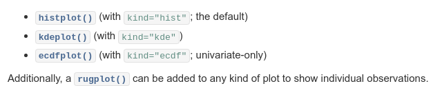
- histplot: Plot univariate or bivariate histograms to show distributions of datasets.
- kdeplot :Plot univariate or bivariate distributions using kernel density estimation.
- Less useful to me now:
- ecdfplot: Plot empirical cumulative distribution functions.
- rugplot: add ticks to axes with the distribution, usually in addition to other plots
- displot is the figure-level interface
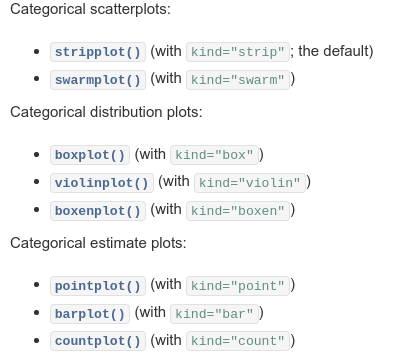
- Categorical plots
- seaborn.catplot is the figure-level interface
-
- Regression plots
- seaborn.relplot
- scatterplot (with
kind="scatter"; the default) - lineplot (with
kind="line")
- Matrix plots
And again, the already mentioned special cases, now with pictures:
sns.jointplot()3 has one plot with distributions around it and is a JointGrid: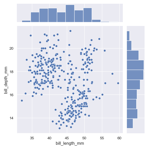
sns.pairplot()4 “visualizes every pairwise combination of variables simultaneously” and is a PairGrid:
Design
Marks
The parameters for marks are described better in the tutorial than I ever could: Properties of Mark objects — seaborn 0.12.2 documentation:
- Coordinates
- Colors
- Marker/line styles
- Size
- Text
- Align, size, offset
TODO my main remaining question is where/how do I set this? Can this be done outside the seaborn.objects interface I don’t want to learn.
Markers
- Marker size Pass e.g.
s=30to the plotting function. (size=would be a column name) - Marker style: you are infinitely flexible actually! And this even goes in the legend
-
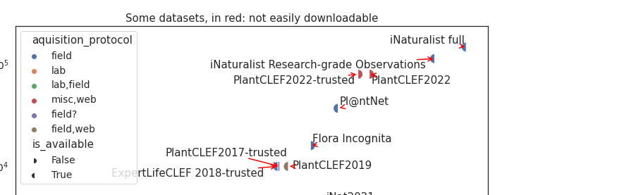
sns.scatterplot( style="is_available", # marker=MarkerStyle("o", "left"), markers={True: MarkerStyle("o", "left"), False: MarkerStyle("o", "right")}, )- See matplotlib Marker reference — Matplotlib 3.7.1 documentation
Individual questions/topics
Colors, palettes, themes etc
- SNS:
- Matplotlib:
- A lot of theory + list of seaborn’s palettes: Choosing Colormaps in Matplotlib — Matplotlib 3.7.1 documentation
- List of pre-existing ones: Colormap reference — Matplotlib 3.7.1 documentation
Setting theme and context
Controlling figure aesthetics — seaborn 0.12.2 documentation
There are five preset seaborn themes: dark, white, ticks, whitegrid, darkgrid. This picture contains the first four of the above in this order.
set_context()
Color palettes
The tutorial has this: Choosing color palettes — seaborn 0.12.2 documentation with both a theoretical basis about color and stuff, and the “how to set it in your plot”.
TL;DR sns.color_palette(PALETTE_NAME, NUM_COLORS, as_cmap=TRUE_IF_CONTINUOUS)
seaborn.color_palette() returns a list of colors or a continuous matplotlib ListedColormap colormap:
-
Accepts as
palette, among other things:- Name of a seaborn palette (deep, muted, bright, pastel, dark, colorblind)
- Name of matplotlib colormap
‘light:<color>’, ‘dark:<color>’, ‘blend:<color>,<color>’- A sequence of colors in any format matplotlib accepts
-
n_colors: will truncate if it’s less than palette colors, will extend/cycle palette if it’s more -
as_cmap- whether to return a continuous ListedColormap -
desat -
You can do
.as_hex()to get the list as hex colors. -
You can use it as context manager:
with sns.color_palette(...):to temporarily change the current defaults.
Reversing palettes/colormaps
Matplotlib colormap + _r (tab10_r).
I needed a colormap where male is blue and female is orange, tab10 has these colors but in reversed order. This is how I got a colormap with the first two colors but reversed:
cm = sns.color_palette("tab10",2)[::-1]
First I generated a color_palette of 2 colors, then reversed the list of tuples it returned.
Individual plot types
Distributions
Plotting multiple distributions on the same subplot
histplothas different approaches for plottingmultiple=distributions on the same plot:- layer (default, make them overlap)
- stack (one on top of the other)
- dodge (multiple small columns for each distribution):
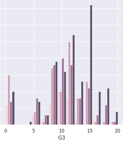
- fill (this beauty):
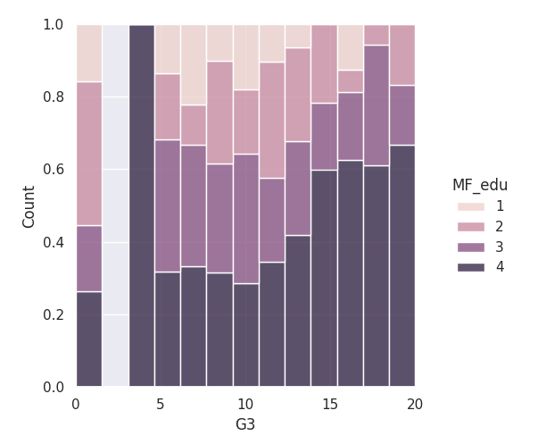
- KDEplot can do this too!
multiple=fill
Categorical
Pointplot
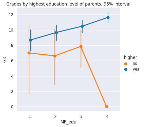
- Errorbars:
- To make the errorbars not-overlap,
dodge=True - You can control their width through
errwidth= - Statistical estimation and error bars — seaborn 0.12.2 documentation has a really cool and thorough description of the types and theory:
The error bars around an estimate of central tendency can show one of two general things: either the range of uncertainty about the estimate or the spread of the underlying data around it. These measures are related: given the same sample size, estimates will be more uncertain when data has a broader spread. But uncertainty will decrease as sample sizes grow, whereas spread will not.
- To make the errorbars not-overlap,
Random
Heatmaps
- To order the rows/columns, you have to use pandas’s
pd.sort_index() - To annotate / add text to the cells:
annot=True, fmt=".1f" - To change the range of the colorbar/colormap , use
vmin=/vmax=
Previously: Small unsystematic posts about seaborn: - Architecture-ish: - 230515-2257 seaborn setting titles etc. with matplotlib set - 230515-2016 seaborn things built on FacetGrid for easy multiple plots - Small misc: - 230428-2042 Seaborn basics - 230524-2209 Seaborn visualizing distributions and KDE plots)