serhii.net
In the middle of the desert you can say anything you want
-
Day 1618 (07 Jun 2023)
Timing stuff in jupyter
Difference between %time and %%time in Jupyter Notebook - Stack Overflow
- when measuring execution time,
%timerefers to the line after it,%%timerefers to the entire cell - As we remember1:
- real/wall the ‘consensus reality’ time
- user: the process CPU time
- time it did stuff
- sys: the operating system CPU time due to system calls from the process
- interactions with CPU system r/w etc.
GBIF data analysis
Format
- GBIF Infrastructure: Data processing has a detailed description of the flow
occurrences.txtis an improved/cleaned/formalizedverbatim.txt- metadata
meta.xmlhas list of all colum data types etc.- for all files in the zip!
- columns links lead to DCMI: DCMI Metadata Terms
metadata.xmlis things like download doi, license, number of rows, etc.
- .zips are in Darwin format: FAQ
- Because there are cases when both single and double quotes etc., and neither
'/"asquotecharwork.
df = vx.read_csv(DS_LOCATION,convert="verbatim.hdf5",progress=True, sep="\t",quotechar=None,quoting=3,chunk_size=500_000) - Because there are cases when both single and double quotes etc., and neither
Tools
- GBIF .zip parser lib:
- BelgianBiodiversityPlatform/python-dwca-reader: 🐍 A Python package to read Darwin Core Archive (DwC-A) files.
- Tried it, took a long time both for the zip and directory, so I gave up
- gbif/pygbif: GBIF Python client
- API client, can also do graphs etc., neat!
Analysis
Things to try:
limit number of columns throughpd.read_csv.usecols()1 to the ‘interesting’ ones- optionally take a smaller subset of the dataset and drop all
NaNs - take column indexes from
meta.xml - See if someone already did this:BelgianBiodiversityPlatform/python-dwca-reader: 🐍 A Python package to read Darwin Core Archive (DwC-A) files.
- optionally take a smaller subset of the dataset and drop all
Vaex as faster pandas alternative
I have a larger-than-usual text-based dataset, need to do analysis, pandas is slow (hell, even
wc -ltakes 50 seconds…)Vaex: Pandas but 1000x faster - KDnuggets - that’s a way to catch one’s attention.
Reading files
I/O Kung-Fu: get your data in and out of Vaex — vaex 4.16.0 documentation
vx.from_csv()reads a CSV in memory, kwargs get passed to pandas’read_csv()vx.open()reads stuff lazily, but I can’t find a way to tell it that my.txtfile is a CSV, and more critically - how to pass params likesepetcvx.from_ascii()has a parameter called sepe rator?! API documentation for vaex library — vaex 4.16.0 documentation
- the first two support
convert=that converts stuff to things like HDFS, optionallychunk_size=is the chunk size in lines. It’ll create $N/chunk_size$ chunks and concat together at the end. - Ways to limit stuff:
nrows=is the number of rows to read, works with convert etc.usecols=limits to columns by name, id or callable, speeds up stuff too and by a lot
Writing files
- I can do
df.export_hdf5()in vaex, but pandas can’t read that. It may be related to the opposite problem - vaex can’t open pandas HDF5 files directly, because one saves them as rows, other as columns. (See FAQ) - When converting csv to hdf5, it breaks if one of the columns was detected as an
object, in my case it was a boolean. Objects are not supported1, and booleans are objects. Not trivial situation because converting that to, say, int, would have meant reading the entire file - which is just what I don’t want to do, I want to convert to hdf to make it manageable.
Doing stuff
Syntax is similar to pandas, but the documentation is somehow .. can’t put my finger on it, but I don’t enjoy it somehow.
Stupid way to find columns that are all NA
l_desc = df.describe()
# We find column names that have length_of_dataset NA values
not_empty_cols = list(l_desc.T[l_desc.T.NA!=df.count()].T.columns)
# Filter the description by them
interesting_desc = l_desc[not_empty_cols]
Using a virtual environment inside jupyter
Use Virtual Environments Inside Jupyter Notebooks & Jupter Lab [Best Practices]
Create and activate it as usual, then:
python -m ipykernel install --user --name=myenv
- when measuring execution time,
-
Day 1617 (06 Jun 2023)
jupyter notebook, lab etc. installing extensions magic, paths etc.
It all started with the menu bar disappearing on qutebrowser but not firefox:
Broke everything when trying to fix it, leading to not working vim bindings in
lab. Now I have vim bindings back and can live without the menu I guess.It took 4h of very frustrating trial and error that I don’t want to document anymore, but - the solution to get vim bindings inside jupyterlab was to use the steps for installing through jupyter of the extension for notebooks, not the recommended lab one.
Installation · lambdalisue/jupyter-vim-binding Wiki:mkdir -p $(jupyter --data-dir)/nbextensions/vim_binding jupyter nbextension install https://raw.githubusercontent.com/lambdalisue/jupyter-vim-binding/master/vim_binding.js --nbextensions=$(jupyter --data-dir)/nbextensions/vim_binding jupyter nbextension enable vim_binding/vim_bindingI GUESS the issue was that previously I didn’t use
--data-dir, and tried to install as-is, which led to permission hell. Me downgrading -lab at some point also helped maybe.The recommended
jupyterlab-vimpackage installed (through pip), was enabled, but didn’t do anything: jwkvam/jupyterlab-vim: Vim notebook cell bindings for JupyterLab.Also, trying to install it in a clean virtualenv and then doing the same with pyenv was not part of the solution and made everything worse.
Useful bits
Getting paths for both
-laband classic:> jupyter-lab paths Application directory: /home/sh/.local/share/jupyter/lab User Settings directory: /home/sh/.jupyter/lab/user-settings Workspaces directory: /home/sh/.jupyter/lab/workspaces > jupyter --paths config: /home/sh/.jupyter /home/sh/.local/etc/jupyter /usr/etc/jupyter /usr/local/etc/jupyter /etc/jupyter data: /home/sh/.local/share/jupyter /usr/local/share/jupyter /usr/share/jupyter runtime: /home/sh/.local/share/jupyter/runtimeRemoving ALL packages I had locally:
pip uninstall --yes jupyter-black jupyter-client jupyter-console jupyter-core jupyter-events jupyter-lsp jupyter-server jupyter-server-terminals jupyterlab-pygments jupyterlab-server jupyterlab-vim jupyterlab-widgets
pip uninstall --yes jupyterlab nbconvert nbextension ipywidgets ipykernel nbclient nbclassic ipympl notebook
To delete all extensions:
jupyter lab clean --allRelated: 230606-1428 pip force reinstall package
Versions of everything
> pip freeze | ag "(jup|nb|ipy)"
ipykernel==6.23.1
ipython==8.12.2
ipython-genutils==0.2.0
jupyter-client==8.2.0
jupyter-contrib-core==0.4.2
jupyter-contrib-nbextensions==0.7.0
jupyter-core==5.3.0
jupyter-events==0.6.3
jupyter-highlight-selected-word==0.2.0
jupyter-nbextensions-configurator==0.6.3
jupyter-server==2.6.0
jupyter-server-fileid==0.9.0
jupyter-server-terminals==0.4.4
jupyter-server-ydoc==0.8.0
jupyter-ydoc==0.2.4
jupyterlab==3.6.4
jupyterlab-pygments==0.2.2
jupyterlab-server==2.22.1
jupyterlab-vim==0.16.0
nbclassic==1.0.0
nbclient==0.8.0
nbconvert==7.4.0
nbformat==5.9.0
scipy==1.9.3
widgetsnbextension==4.0.7
Bad vibes screenshot of a tiny part of
history | grep jup
“One of the 2.5 hours I’ll never get back”, Serhii H. (2023).
Oil on canvas
Kitty terminal,scrotscreenshotting tool, bash.
Docker unbuffered python output to read logs live
Docker image runs a Python script that uses
print()a lot, butdocker logsis silent because pythonprint()uses buffered output, and it takes minutes to show.Solution1: tell python not to do that through an environment variable.
docker run --name=myapp -e PYTHONUNBUFFERED=1 -d myappimage
pip force reinstall
TIL about
pip install packagename --force-reinstall1
-
Day 1616 (05 Jun 2023)
Useful writing cliches
- Since then, we have witnessed an increased research interest into
- Technical developments have gradually found their way into
- comprehensive but not exhaustive review
…
(On a third thought, I realized how good ChatGPT is at suggesting this stuff, making this list basically useless. Good news though.)
Dia save antialiased PNG
I love Dia, and today I discovered that:
- It can do layers! That work as well as expected in this context
- To save an antialiased PNG, you have to explicitly pick “png (antialiased)” when exporting, it’s in the middle of the list and far away from all the other flavours of .png extensions
Before and after:

-
Day 1615 (04 Jun 2023)
Adventures in plotting things on maps
So I have recorded a lot of random tracks of my location through the OSMAnd Android app and I wanted to see if I can visualize them. This was a deep dive into the whole topic of visualizing geo data.
Likely I got some things wrong but I think I have a picture more or less of what exists, and I tried to use a lot of it.
Basics
Formats
GPX
OSMAnd gives me
.gpxfiles.(I specifically would like to mention OsmAnd GPX | OsmAnd, that I should have opened MUCH earlier, and that would have saved me one hour trying to understand why do the speeds look strange: they were in meters per second.)
A GPX file give you a set(?) of tracks composed of segments that are a list of points, with some additional optional attributes/data with them.
GeoJSON
Saw it mentioned the most often, therefore in my head it’s an important format.
Among other things, it’s one of the formats Stadt Leipzig provides data about the different parts of the city in, and I used that data heavily: Geodaten der Leipziger Ortsteile und Stadtbezirke - Geodaten der Leipziger Ortsteile - Open Data-Portal der Stadt Leipzig
Less important formats
Are out of scope of this and I never used them, but if I had to look somewhere for a list it’d be here: Input/output — GeoPandas 0.13.0+0.gaa5abc3.dirty documentation
Getting data
- Export | OpenStreetMap is awesome, and I used it really often to get GPS coordinates of places when I needed it.
- Random gov’t websites provide geospatial data surprisingly often! Including the already mentioned city of Leipzig.
- Some maps can be downloaded automagically from python code just by providing not even coordinates, but a plain text location like an address! Below there will be examples but Guide to the Place API — contextily 1.1.0 documentation made me go “wow that’s so cool!” immediately
- A lot of apps can record GPX tracks, it seems to be the de-facto standard format for that (be it for hiking / paragliding / whatever)
Libraries
gpgpy for reading GPX files
Really lightweight and is basically an interface to the XML content of such files.
import gpxpy

# Assume gpx_tracks is a list of Paths to .gpx files
data = list()
for f in tqdm.tqdm(gpx_tracks):
    gpx_data = gpxpy.parse(f.read_text())
	# For each track inside that file
    for t in gpx_data.tracks:
		# For each segment of that track
        for s in t.segments:
			# We create a row
            el = {"file": f.name, "segment": s}
            data.append(el)

# Vanilla pd.DataFrame with those data
df = pd.DataFrame(data)

# We add more info about each segment
df["time_start"] = df["track"].map(lambda x: x.get_time_bounds().start_time)
df["time_end"] = df["track"].map(lambda x: x.get_time_bounds().end_time)
df["duration"] = df["track"].map(lambda x: x.get_duration())
df
At the end of my notebook, I used a more complex function to do the same basically:
WITH_OBJ = False
LIM=30

data = list()

# Ugly way to enumerate files
fn = -1
for f in tqdm.tqdm(gpx_tracks[:LIM]):
	fn += 1
	gpx_data = gpxpy.parse(f.read_text())
	for tn, t in enumerate(gpx_data.tracks):
		for sn, s in enumerate(t.segments):
			# Same as above, but with one row per point now:
			for pn, p in enumerate(s.points):
				# We get the speed at each point
				point_speed = s.get_speed(pn)
				if point_speed:
					# Multiply to get m/s -> km/h
					point_speed *= 3.6
				el = {
					"file": f.name,
					"file_n": fn,
					"track_n": tn,
					"seg_n": sn,
					"point_n": pn,
					"p_speed": point_speed,
					"p_lat": p.latitude,
					"p_lon": p.longitude,
					"p_height": p.elevation,
				}
				# If needed, add the individual objects too
				if WITH_OBJ:
					el.update(
						{
							"track": t,
							"segm": s,
							"point": p,
						}
					)
				data.append(el)
ft = pd.DataFrame(data)
gft = gp.GeoDataFrame(ft, geometry=gp.points_from_xy(ft.p_lon, ft.p_lat))
Then you can do groupbys etc by file/track/segment/… and do things like mean segment speed:
gft.groupby(["file_n", "track_n", "seg_n"]).p_speed.transform("mean")
gft["seg_speed"] = gft.groupby(["file_n", "track_n", "seg_n"]).p_speed.transform("mean")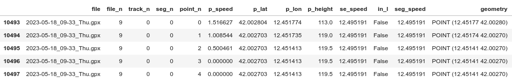
GeoPandas
GeoPandas 0.13.0 — GeoPandas 0.13.0+0.gaa5abc3.dirty documentation
It’s a superset of pandas but with more cool additional functionality built on top. Didn’t find it intuitive at all, but again new topic to me and all that.
Here’s an example of creating a
GeoDataFrame:import geopandas as gp # Assume df_points.lon is a pd.Series/list-like of longitudes etc. pdf = gp.GeoDataFrame( df_points, geometry=gp.points_from_xy(df_points.lon, df_points.lat) ) # we have a GeoDataFrame that's valid, because we created a `geometry` that gets semantically parsed as geo-data now!Theoretically you can also read .gpx files directly, adapted from GPS track (GPX-Datei) in Geopandas öffnen | Florian Neukirchen to use
pd.concat:gdft = gp.GeoDataFrame(columns=["name", "geometry"], geometry="geometry") for file in gpx_tracks: try: f_gdf = gp.read_file(file, layer="tracks") gdft = pd.concat([gdft, f_gdf"name", "geometry"]) except Exception as e: pass # print("Error", file, e)Problem with that is that I got a GeoDataFrame with shapely.MultiLineStrings that I could plot, but not easily do more interesting stuff with it directly:
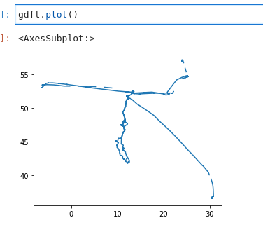
Under the hood, GeoPandas uses Shapely a lot. I love shapely, but I gave up on directly reading GPX files with geopandas", and went with the gpgpy way described above.
Spatial Joins
Merging data — GeoPandas 0.13.0+0.gaa5abc3.dirty documentation, first found on python - Accelerating GeoPandas for selecting points inside polygon - Geographic Information Systems Stack Exchange
Are really cool, and you can merge two different geodataframes based on whether things are inside/intersecting/outside other things, with the vanilla join analogy holding well otherwise.
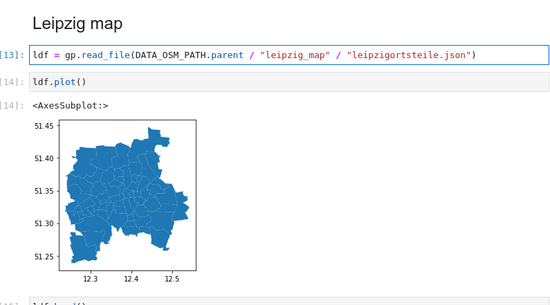
FOR EXAMPLE, we have the data about Leipzig
ldffrom before: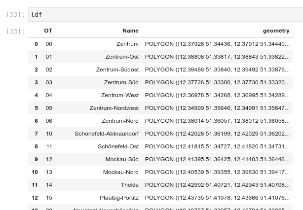
We can
pdf = pdf.sjoin(ldf, how="left", predicate="intersects")it with our
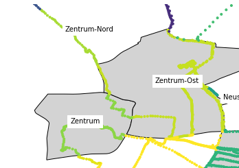
pdfdataframe with points, it automatically takes thegeometryfrom both, finds the points that are inside different parts of Leipzig, and you get your points with the columns from the part of Leipzig they’re located at!Then you can do pretty graphs with the points colored based on that, etc.:
TODO
Adding a background map to plots — GeoPandas 0.13.0+0.gaa5abc3.dirty documentation contextily/intro_guide.ipynb at main · geopandas/contextily · GitHub DenisCarriere/geocoder: Python Geocoder API Overview — geocoder 1.38.1 documentation Sampling Points — GeoPandas 0.13.0+0.gaa5abc3.dirty documentation
Guide to the Place API — contextily 1.1.0 documentation Quickstart — Folium 0.14.0 documentation A short look into providers objects — contextily 1.1.0 documentation plugins — Folium 0.14.0 documentation masajid390/BeautifyMarker Plotting with Folium — GeoPandas 0.13.0+0.gaa5abc3.dirty documentation
- Folium exporting map as html through
html_code = m.get_root()._repr_html_()